
So I've got the X-wing modeled and I played with my patented blatant ripoff of Frank Millers black and white look- Hee hee.
I still need to seriously texture it and do the rigging (of which there is none on the Tie Fighter- I'm not sure if I'm gonna rig all the ships but the X-wing does demand those wings to open in a scene!
Once I get this thing textured and rigged I'm probably gonna give a run at some of the scenes I've worked out- but the SMART thing to do would be to get set on finalizing my design ideas for the actual characters. I don't know why it's been so hard for me to just settle on a design and run with it but it needs to be done.
Anyone else ever have this problem?
5/04/2010
The X-Wing
3/29/2010
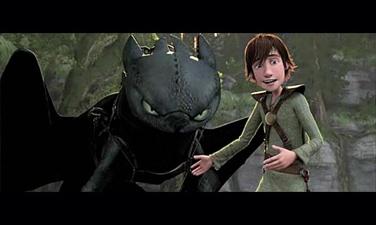
How To Train Your Dragon
I know, I know. "I already know how to train MY Dragon!- Hyuk, hyuk-yuk!"
Now that we got that out of the way-
Dreamworks is getting better and better at this animation thing.
HTTYD was pretty good. It ain't exactly Pixar at it's best- (UP, NEMO, The Incredibles) but it is of that quality. I liked it better than- Cars, Toy Story 2 and maybe even Monsters Inc...Nah...It's about right on par with Monsters Inc.
It's a little predictable at times but the way they pull the story off makes up for it and there are a couple of surprises.
You feel for the lead character as he tries to make his case AND there are some very nice touchy, feely things in there too.
The visuals are STUNNING. I love the design of the characters. They are textured in a way that is quasi-realistic and very appealing.
The animation (motion) is top notch, too.
I'm normally distracted by "hair" in these 3D films (I much prefer "hard hair" over realistic hair on cartoon characters) but this wasn't bad. I mean, I DID find myself staring at it a couple of times but it wasn't unappealing.
Speaking of 3D- as Dreamworks has promised since Monsters vs. Aliens- this film requires you wear glasses so that things poke out at you. Yes. It is a gimmick but it's a gimmick I enjoy- for the most part.
This movie is 3d through and through and it's great- HOWEVER- it's that 3d that is in your face (which I liked) not like UP where after 30 minutes you forget. Don't get me wrong- it's done in a tactful way but it IS in your face. My only real problem with it was getting used to a little distortion in my peripheral. That might be a personal problem though.
That said, I would like to own it so I can watch it over and over again. There is so much I missed out on because it was going so fast and I was so amazed by the backgrounds and overall artistic layout of it all.
I dug it...
Now, to get back to learning how to rig!
2/17/2010
Scene 001-
After I finished the the generic Tie Fighter- there were so many paths I could take as far as moving on to the next thing:
Build Mac-Vader's Tie fighter
Build the Cockpit for the Tie Fighters
Finish the X-wing (which I'm close to doing)
Get a final design on the Characters and build them
Figure out how I'm going to animate the CHARACTERS
But the excitement of having a completed ship made me ache to try and see something finished- or closed to it... So I decided to work on the first scene of the animation.
As cliche as it is to break out the Star Wars style title and float it back, followed by the introduction paragraph- it HAD to be done...
I figured I would jump in and knock that out...because it's just a couple of graphics, floating over space and then I have the Tie fly by- which will eventually reveal the Mac Star- It's SIMPLE, right!?
MAN! That shit was difficult as hell to get the timing right.
And that was WITH having an animatic of the scene I created in Flash.
So in this movie you will see the animatic of scene one followed by the actual scene one in progress.
I Got Jacked animatic...scene 001 from kimmygorden on Vimeo.
This is the animatic for scene 001 of my animation for "I Got Jacked When I Bought A Mac" It's still a work in progress-
I hope to put the final up for this scene soon (as I remodel the mac star and straighten out my Tie flyby issues).
As you can see, it's been a hell of an upgrade from the animatic.
I did go with the cliche Sith Wars pull back but added the a title reveal much like I thought would have happened with "The Empire Strikes Back".
You will notice a sort of slow down of the title as it gets further back. Sometimes when I see this it annoys me and then other times I really like it (it makes me feel like the original SW which had little things like that going on in it).
If I change the in-out of the right key frame it would probably fix the situation. I might do something with that.
I like the wording of the paragraphs but they take a little while because it is a lot to read. I've gotten used to it but I may cut a version that doesn't have that in it. People are so impatient these days.
So I'm pretty happy with everything else...Yeah, RIGHT!
Here is what I want to fix:
I've already redone the flyby of the tie fighter- In this scene I had the frame rate wrong but I wanted to see the compositioning.
In the remake you REALLY get a good look at the logo on the wing but I don't like the way it glows so I'm gonna try to amp that up as well.
I've remodeled the Mac Star since I started to compose this post- which really wasn't that bad because I did like what I had created before I just needed more detail (the Mac Star you see in the picture is just a drawing- hee hee).
I plan to add some lights to the Mac Star to flesh it out a little more.
I have some flares in the shot but I'm not sure they work. It might be better to use some lighting and blend the composition better. Maybe shroud the Mac Star in some natural darkness.
Space is boring. I mean, it looks pretty and all but it just sits there.
In my mind I've flirted with the idea of making the blackness of space more fluid- kind of a shifting darkness. Then other times I like how still it is. So I'm gonna play with that.
I got rid of the planets that were in the flash animatic but I might put them in...idunno.
After that I have sound efx and music to add...I played with one little ditty but I'm not happy with it at ALL.
Well, back to work.
1/29/2010
Tie Fighter Action
'Sup Crickets!
I'm back in action. There is so much I can post but I'm gonna go with my latest completion...The Mac Tie! 
This here is the Desktop version because it is in fact, my wallpaper right now- HOWEVER there is a problem with it... It's too close to the actual Mac logo.
I actually drew this logo myself so it's not exact but it's pretty damn close. It's "Hey! Take it down or we're gonna sue you!" close.
When I complete this thing, I don't know HOW Apple is going to react-
They could be cool and see the video as the parody that it is...or they could be a bunch of assholes and try to strong hand me. I can't leave that to chance.
I mean- the song I don't worry about because I'm telling a story that happened to me. It's personal and it's my opinion.
But I want to be careful with the images I put out there. Mr. Lucas will be cool I think but I'm not dissing Star Wars.
So this was the time to make a big decision:
Do I complete the animation with the real logo and wait until I hear from someone at Apple before I take it down?-
OR
Do I do the animation with an original logo and hope people connect the dots enough that the video is still funny?
Believe it or not- I was heavily considering option one, with the idea that I would have a backup animation with all the logos switched out AND I was designing things so that all I had to do is click a button or turn off a layer so the Mac logo would be gone...
But then I said "forget it" when I really realized how much double work I'd be (and was) doing.
The best thing to do would be to make a symbol that people would instantly think was the Mac logo although it is not.
I thought about adding an extra bite out of the apple but went with this:
See!? TWO LEAVES!
That oughta do it. Here it is in action:
and from the back:
I hope that is enough. Thoughts?
Yup, I thought you would say that... crickets.
Subscribe to:
Comments (Atom)
